Below are quick examples, just to give you an idea of what the functions in this directory do. You can run the examples yourself, but the resulting graphs are shown here for those who do not do so.
In each of the cases below, I opted for parallel computation, usually with a 2-node cluster that I named c2, run on a dual-core machine.
For the details of the function arguments, see the online help, e.g. by typing
> ?freqparcoord
A longtime issue with parallel coordinates plots has been that a plot quickly fills up as the data size grows; the screen is just too cluttered for the viewer to discern much meaning. Another problem is that it's difficult to visualize the relationships between variables that are far from each other in the plot.
One type of solution that has been proposed for the screen clutter problem is to estimate the multivariate density function of the variables, and then plot the density (or use alpha blending, which can be shown to be equivalent). An approach to the problem of far-apart variables is to look at several versions of a plot, permuting the order of the variables.
The freqparcoord() function in the BDGraphs library takes a novel approach to this problem, by plotting only a few "typical" lines, meaning those that have the largest density values. Not only does this address the screen clutter problem, but also the fact that only a few typical lines are plotted makes it easier to notice relationships between far-apart variables.
This is not to say that it is necessarily sufficient to look at the typical case. (The function offers the option of plotting a random subsample of points, with lines code by density value.) But by focusing on "typical" cases, one may obtain valuable insight into the relations between the variables.
This example uses a baseball player data set from UCLA. It is included in the BDGraphs package, courtesy of the UCLA Statistics Dept. Here are the results, graphed by type of player position:
data(baseball)
freqparcoord(baseball,5,4:6,7,cls=c2,method="extremedens",coding="color")
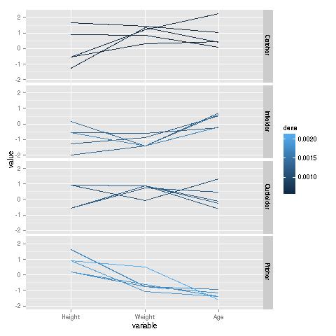
Remember, the plotted lines are "typical," i.e. they are the ones having the maximal density in each group. We see a marked contrast between the various positions. Pitchers are typically tall, relatively thin, and young. By contrast, catchers typically are much heavier, and substantially older; their typical heights have more of a range. On the other hand, compared to catchers, infielders are typically shorter, lighter and younger.
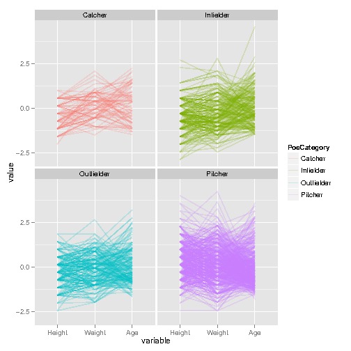
A graph of the full data is less revealing:
I downloaded this data from the letter-recognition set at UC Irvine. The variables concerning various properties of images of the letters; see the above link for details. Here is the analysis:
ltrs <- read.csv("../Data/LetterRecog/letter-recognition.data",header=F,
   stringsAsFactors=F)
ltrsqofet <- rbind(
                ltrs[ltrs$V1=="E",],
                ltrs[ltrs$V1=="T",],
                ltrs[ltrs$V1=="F",],
                ltrs[ltrs$V1=="O",],
                ltrs[ltrs$V1=="Q",])
freqparcoord(ltrsqofet,2,2:17,1,cls=c2,method="extremedens",coding="color")
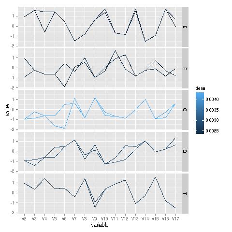
Analysis of these lines is really for a domain expert, yet it is interesting to see how similar the typical lines are for the letters 'O' and 'Q'--two letters that differ only by one stroke--yet there is substantial divergence between two other letters that differ by a single stroke, 'E' and 'F'.
This function is a bit harder to get used to, but it can be very illuminating. To explain it, it's easiest to go right to an example.
I downloaded this from the Adult data in the UCI repository. The goal here is to identify factors related to having a high income. Here is the code and graph, followed by an explanation:
ad <- read.csv("../Data/Adult/adult.data",header=T,stringsAsFactors=F)
# $50K was considered high income in 1990
ad$gt50 <- as.integer(ad[,15] == " >50K")
# need to recode the education variable to years
tmp <- ad[,5]
tmp <- ifelse(tmp==3,50,tmp)
tmp <- ifelse(tmp==4,70,tmp)
tmp <- ifelse(tmp==5,90,tmp)
tmp <- ifelse(tmp==6,100,tmp)
tmp <- ifelse(tmp==7,110,tmp)
tmp <- ifelse(tmp==9,120,tmp)
tmp <- ifelse(tmp==10,130,tmp)
tmp <- ifelse(tmp==11,140,tmp)
tmp <- ifelse(tmp==12,140,tmp)
tmp <- ifelse(tmp==13,160,tmp)
tmp <- ifelse(tmp==14,180,tmp)
tmp <- ifelse(tmp==15,200,tmp)
tmp <- ifelse(tmp==16,210,tmp)
ad$edu <- tmp / 10
ad$age <- ad[,1]
ad$male <- as.integer(ad[,10]==" Male")
boundary(ad,16,18:17,19,cls=c2)
Here I found the nonparametric estimate of the regression of Z (indicator variable for high income) against X (age) and Y (years of education), and then found the boundary curve corresponding to a 20% likelihood of high income. The red and blue curves are for men and women, respectively. (One could add labels to the curves by calls to geom_text() or annotate().)
For example, the point (40,12) is approximately on the red curve, meaning that men of that age and number of years of education have a 20% chance of high income. More years of education increases the probability, and fewer than 12 years decreases it. Or, keeping education constant, being older also makes the probability go above 20% (until about age 80).
But the red curve is higher. For a given age, women need more years of education to reach a 20% probability of high income. It is interesting to note that women fare only slightly worse than men up until about age 45, after which there is large divergence.
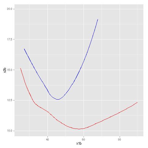
Here I used the airline on-time performance data, for the year 2008, for the airports IAD, IAH and SFO. Z, X and Y were arrival delay, departure delay and flight distance, respectively. Here are the code and results:
air <- read.csv("../Data/Airline/2008.csv",header=T,stringsAsFactors=F)
airiadiahsfo <-
air[
   air$Origin=="IAD" |
   air$Origin=="IAH" |
   air$Origin=="SFO",]
airiadiahsfo <- airiadiahsfo[airiadiahsfo$DepDelay <= 400,]
boundary(airiadiahsfo,15,c(16,19),17,cls=c8,bval=10.0,xlb="DepDelay",ylb="Distance")
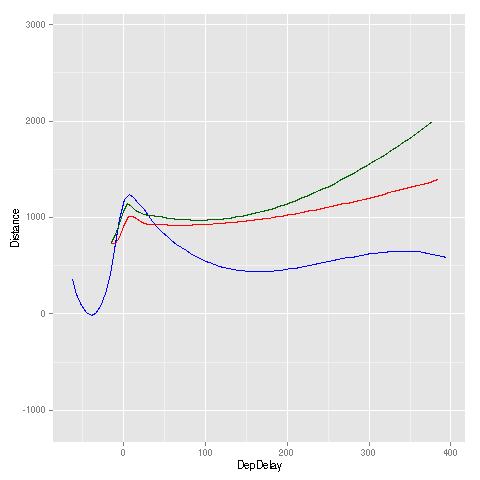
Here, a boundary curve represents the various (DepDelay,Distance) combinations that yield a mean value of ArrDelay of 10.0. A higher curve is better, as it means that, for a given value of departure delay, one needs a longer flight distance before having an expected arrival delay of more than 10 minutes.
Except for the case of small departure delay, San Francisco (green) had the best performance, while Dulles (blue) had the poorest: For any given value of departure delay, SFO needed a much larger flight distance before having a greater-than-10.0 mean arrival delay.
Here again we regress Z on X and Y, but with this function we plot the ratio of the regression functions for two groups. Again, let's look at an example to quickly explain how this works.
I again used the Adult Income data. Here are the code and graph:
ratioest(ad,16,18:17,19,coding="dotsize"," Male",cls=c2,xlb="age",ylb="edu")
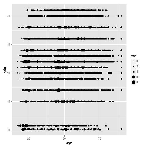
For each (age, education) data point, we plot the ratio of probability of high income for men to the probability for women. The larger the dot, the higher the ratio of the two probabilities. There are clearly some "hot spots." For instance, young women with just a high school diploma (12 years of education) appear to be far less likely than men to have high income. Women over 50 who are college graduates also seem to be faring poorly.
The above plot is somewhat cluttered, partly due to the very discrete nature of X and Y, but also due to overplotting, caused by having a large data set. Due to the latter problem, coding by color instead of dot size, though allowed by the function, is less effective (though more pleasing to the eye). The function allows as an option plotting only a sample of the data, still using the full data for computation, and this alleviates clutter.